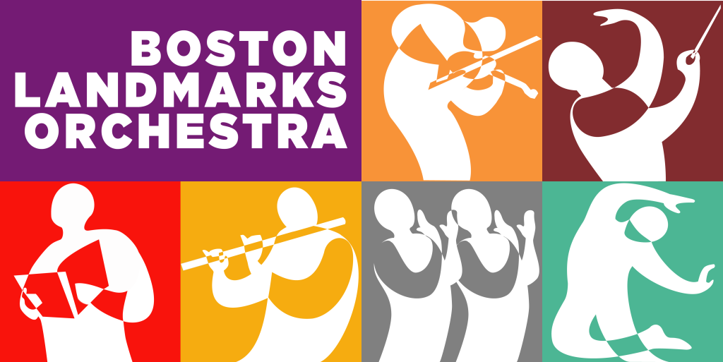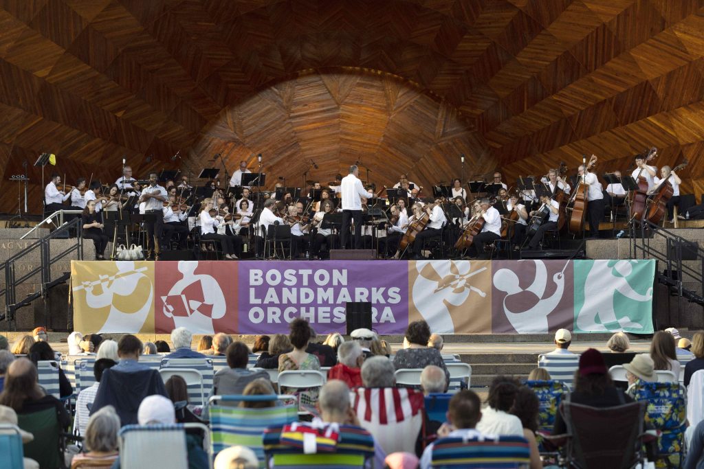
After over twenty years, we changed our logo! The new Landmarks Orchestra logo was designed by one of the members of our Board of Advisors, Alan Pafenbach, who has thoughtfully put together a logo with our mission in mind along with a new, vibrant color palette. He brought his decades of experience with design, marketing and advertising into this process and we are deeply grateful to him. Alan has been on our Board of Advisors since 2021 and has graciously offered his time and knowledge to several large projects including the new logo and designing the materials for our 2022 “Un-Gala”!
Please explain your background.
I grew up in the Berkshires two towns away from Tanglewood. My father’s mother was attended the New England Conservatory and worked with Arthur Fielder in his early days. Despite the presence of music in my early years I drifted more to the visual arts.
I’ve had a 30-year career in advertising and marketing as an art director and creative director. I was an Executive Creative Director at Boston ad agency Arnold and ran the Volkswagen campaign for a decade. But music was always an important part of the commercials we produced for the brand. We reintroduced the world to the forgotten music of Nick Drake for example.
Lately I’ve been returning to my roots as a graphic designer producing branding and logos for a variety of clients including The Boston Landmarks Orchestra
What inspired the new logo’s colors and figures?
The Landmarks team challenged me to come up with a more inclusive and vibrant design to communicate the Orchestra’s mission to bring orchestral music to every community in Boston. I decided that color is an underappreciated element of storytelling. I researched color palettes ranging from West Africa to Central America to Lily Pulitzer and found a common set of colors in each.

What is the message of the new Landmarks logo?
The logo communicates the diversity of the Boston Landmarks Orchestra experience. Orchestral music, dance, solo and choral performances. The colors communicate energy, excitement and inclusivity.

Personal favorite examples of logos you like?
I like very simple, clean, and vibrant logos.
Favorite piece of orchestral music?
Mozart’s Piano Concerto No. 21 in C, “Andante”. So relaxing.
A HUGE thank you to Alan for his time and hard work with this process. Landmarks Orchestra has a vibrant, new look that will reach music-lovers all over the Boston area and beyond!
